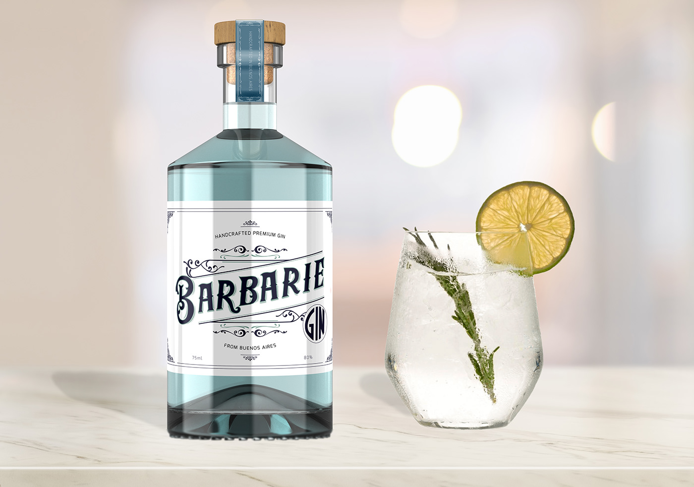
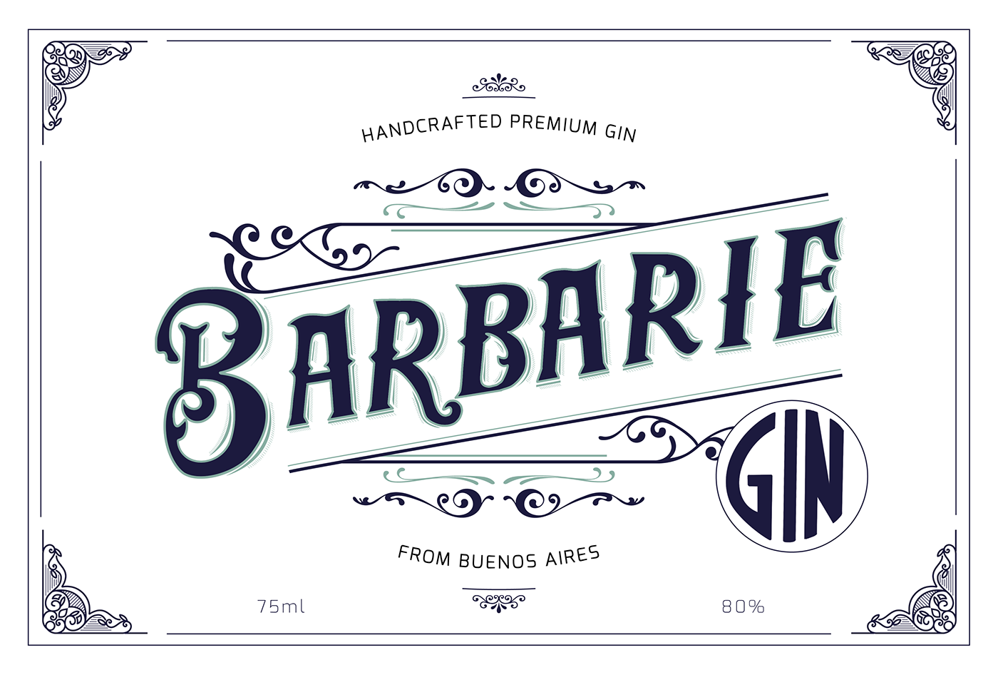
BARBARIE GIN_ is my first personal brand project, and I'm so excited to share with you! I'm a Hand Lettering Lover, so I have to try in this brand label.
The purpose of the project was create an identity of a Premium Gin adding some flavoring of my natal city: Buenos Aires, Argentina.
The word “Barbarie” is the opposite of “civilization” and I think that everyone in Buenos Aires has a piece of Barbarie inside.
I created a vintage strong lettering with some delicate shape and add some element of the “fileteado artistic style” which is typical of my city. However, I sought to maintain minimalism and delicacy throughout the design.
I hope you enjoy to see the process and the final result as much as me.
If you like it, don't forget to appreciate it.
Have a nice day :)
Sol Deferr.
My process starts in paper where I do lots of sketches, then when I choose the best I continue drawing it in Procreate and add some elements to the composition.
Finally, I add details with Photoshop and Illustrator.